Bundle Size Investigation: A Step-by-Step Guide to Shrinking Your JavaScript
Nadia Makarevich

In my previous article about SSR and React Server Components, I talked a bit about "no interactivity gap". The time when the pre-rendered content is already visible, but the JavaScript has not been downloaded yet. As a result, the page is not interactive and might appear broken.
That kinda sucks. So what can be done to reduce it? There is only one answer to that: we need to reduce JavaScript download and execution times. We can try out different compression algorithms, play around with smarter code splitting, and probably hundreds of other useful techniques.
We could also try... here's a radical idea... not to ship that much JavaScript? 😅 I know, I know! Easier said than done. But if you've never investigated what's happening with your bundles, it could be a good exercise to understand the codebase. Plus, it's a ton of fun, if your hobbies include staring into graphs and tracking things down.
Initial Project Setup
First things first. In order to reduce some bundles, we need to have some large bundles. I implemented a Study Project specifically for this, if you want to follow along and confirm everything you read here with your own investigation. You can find it in this repo: https://github.com/developerway/analyze-bundle-size
Install dependencies:
npm install
Build it:
npm run build
Notice its JavaScript size:
5,321.89 kB │ gzip: 1,146.59 kB
Fall to the floor in disbelief. More than 5 megabytes! Good Lord 🤯 What exactly did you implement there, you might ask, and did it take more than a year? That surely took some effort and talent! 🤪
The answer: just added one form and one simple page with not that much functionality to the existing slim project. Took less than an hour.
It's actually incredibly easy to make a small mistake here and there and explode your JavaScript beyond reason. You'll see how and why while reading the article. For now, start the project and navigate back and forth there:
npm run start
There will be a Home page, Settings page with a few forms inside tabs, and an Inbox page with a list of messages. If you hover over messages, a row of buttons appears. Clicking on "Delete" or "Archive" opens the respective modal dialogs.
That's pretty much it. Totally not reasonable to have 5 megabytes of JavaScript to implement that. So, what went wrong?
Analyzing Bundle Size
In order to investigate the offensive megabytes, we need a way to look into their insides.
By "look," I don't mean actually opening the built files in the IDE and staring at them. While we can certainly do that, it will give us exactly zero information and might even cause a headache.
This is the job of the tools known as "bundle analyzers". Since the project is on Vite, I can use a "Rollup Plugin Visualizer" library. If you're on Next.js, you'll need Next's Bundle Analyzer plugin. If you're on something else, just google "name-of-your-bundler + bundle analyzer" - there are lots of them out there.
For this project, there is no need to install anything. Open the vite.config.ts file and find this code:
visualizer({filename: 'stats.html',emitFile: true,template: 'treemap',});
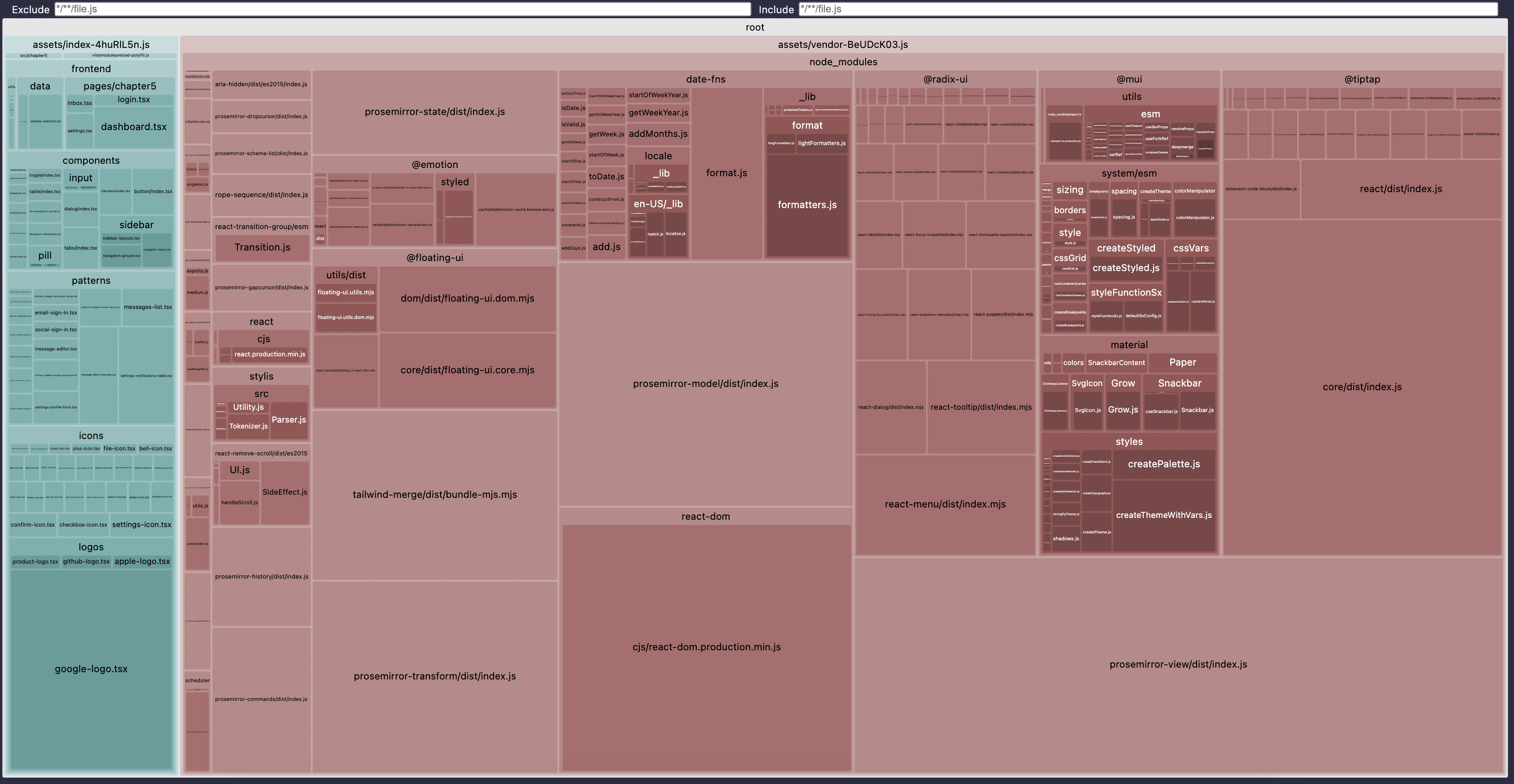
This is the enabled analyzer. If you haven't built the project yet, do it and take a look inside the src/dist/client folder. There should be a stats.html file there. Open it in your browser and wait until it fully loads (might take a while!). When it finishes loading, it should show a graph like this:
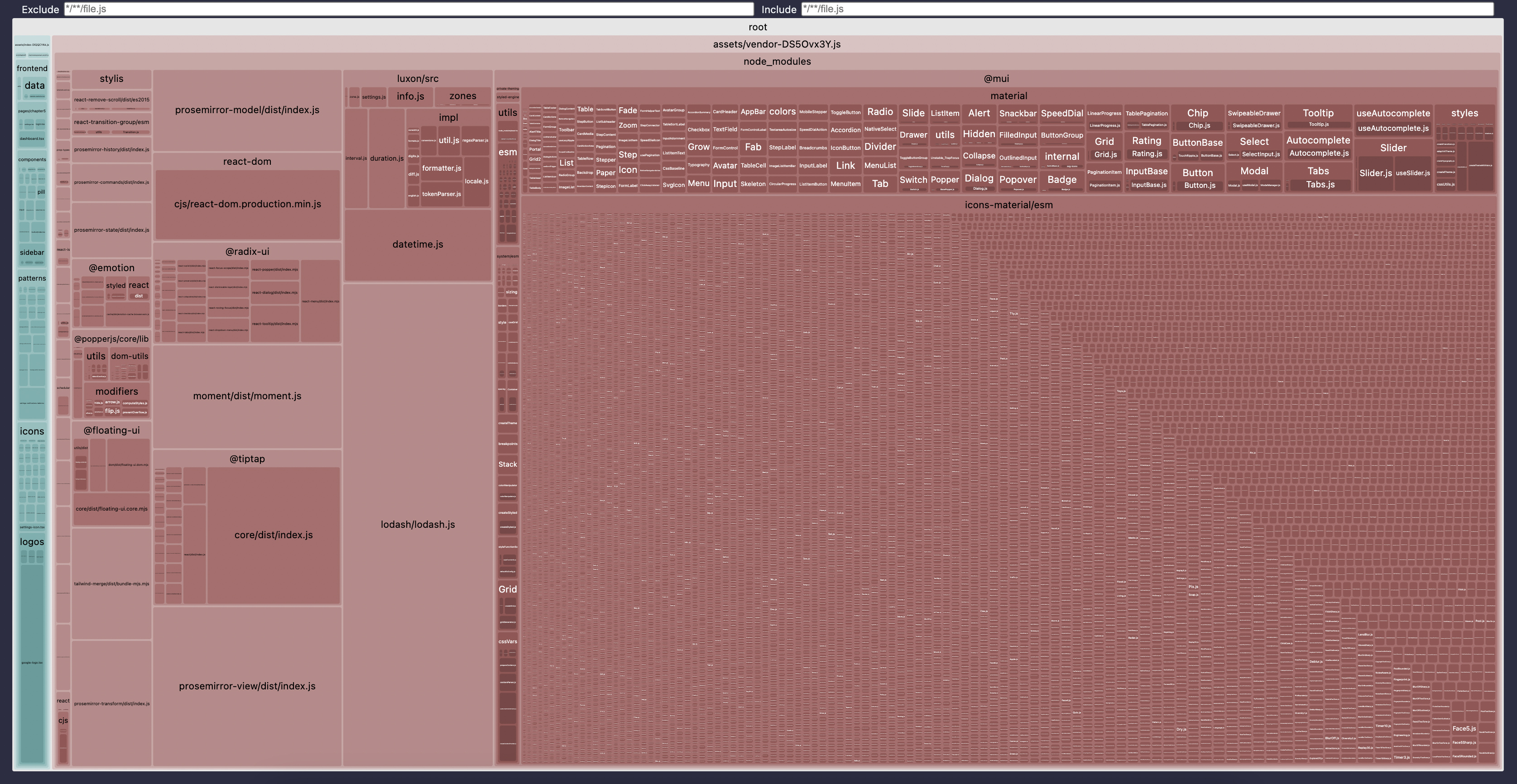
It's a hierarchical visualization of every single JavaScript file in the project. It starts from the "root" at the very top - this is the root of the project, i.e., our src/dist/client folder. Inside, there are two blocks:
- The largest red-ish one is
assets/vendor- this is our vendor chunk. - The teal at the left is
assets/index- this is our own code.
The size of the blocks is relative to the size of the code, so it's pretty obvious from even a brief glance at the picture that the "index" is tiny compared to the red "vendor." Inside the vendor block, there is a node_modules block, different libraries, and so on, and every file is grouped by the file path parts.
Hovering over every block will give you the exact path.
Clicking on any block allows you to "zoom in" and peek at what's inside.
If you want to have more fun with it, you can generate different types of visualizations. For example, if you change the config to this:
visualizer({filename: 'stats.html',emitFile: true,// different types of visualizationstemplate: 'flamegraph',});
And rebuild the project, it will give you a Flame Graph instead of this two-dimensional map. If you only have a vague idea of how to read Flame Graphs, I, of course, have an article for you 😉
After you have the visualization, it's a matter of putting your detective hat on and starting the investigation. Usually, it just means staring at the map until your eyes are watering, noticing unreasonably large areas, recognizing the library from it (or googling it if you have no idea), then going through the code and trying to understand whether you can remove the usages of this library and what it will cost.
Let's do it together to understand the process. We'll follow this process for every package we're going to investigate.
Investigation Process
Step 1: Identify a Package to Eliminate
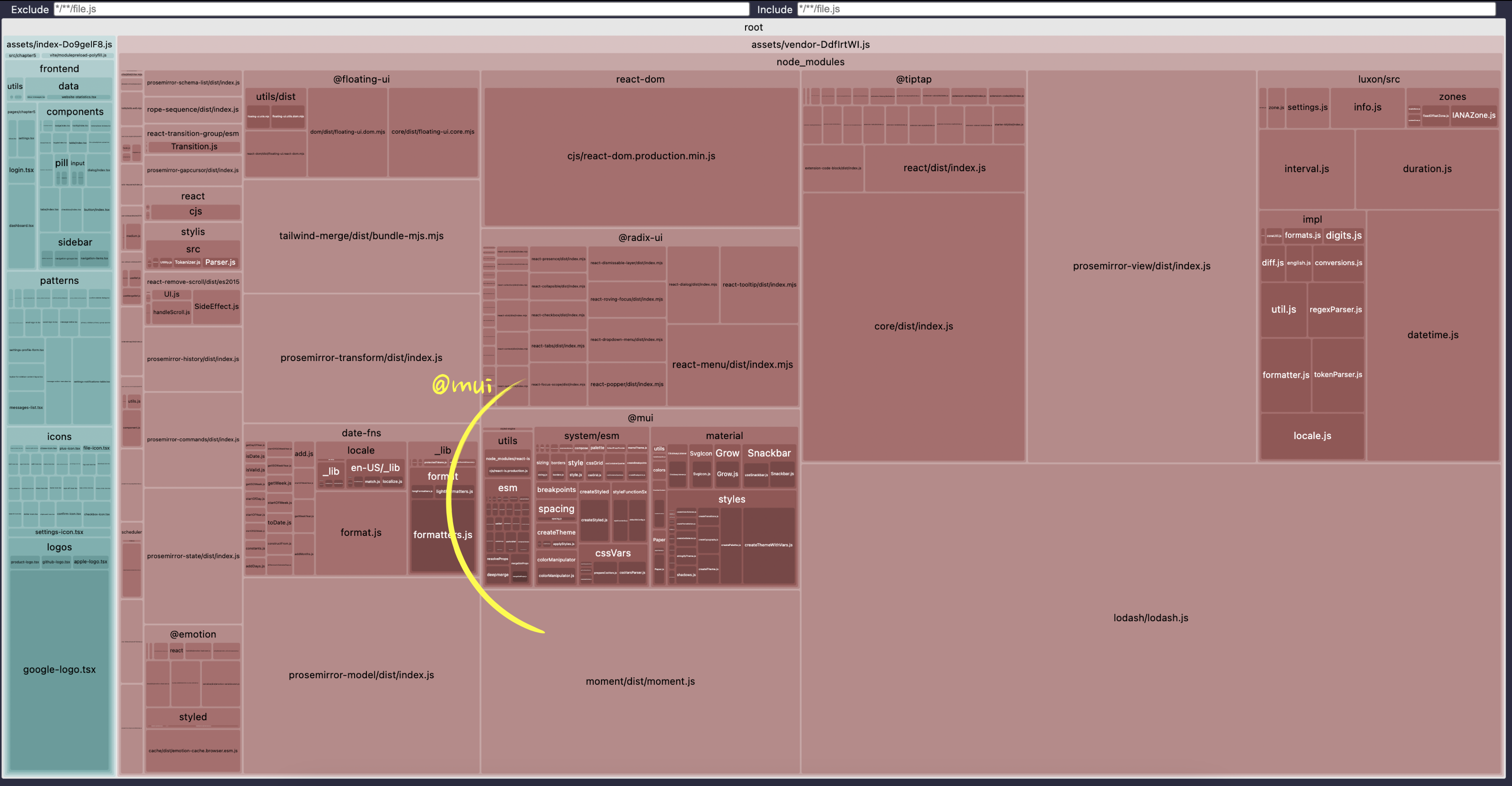
The very first huge block that I immediately notice here is everything under the @mui title inside the node_modules block, which contains a number of npm packages installed as the project dependencies. And we know naming convention for npm packages - it's either one word (with dashes), or two words separated by /, where the first word is a namespace and starts with @. So everything directly under the node_modules title is either a package or a namespace for multiple packages.
Since @mui starts with @, it's a namespace, and everything directly under it will be a package. This gives us two packages: @mui/material and @mui/icons-material.
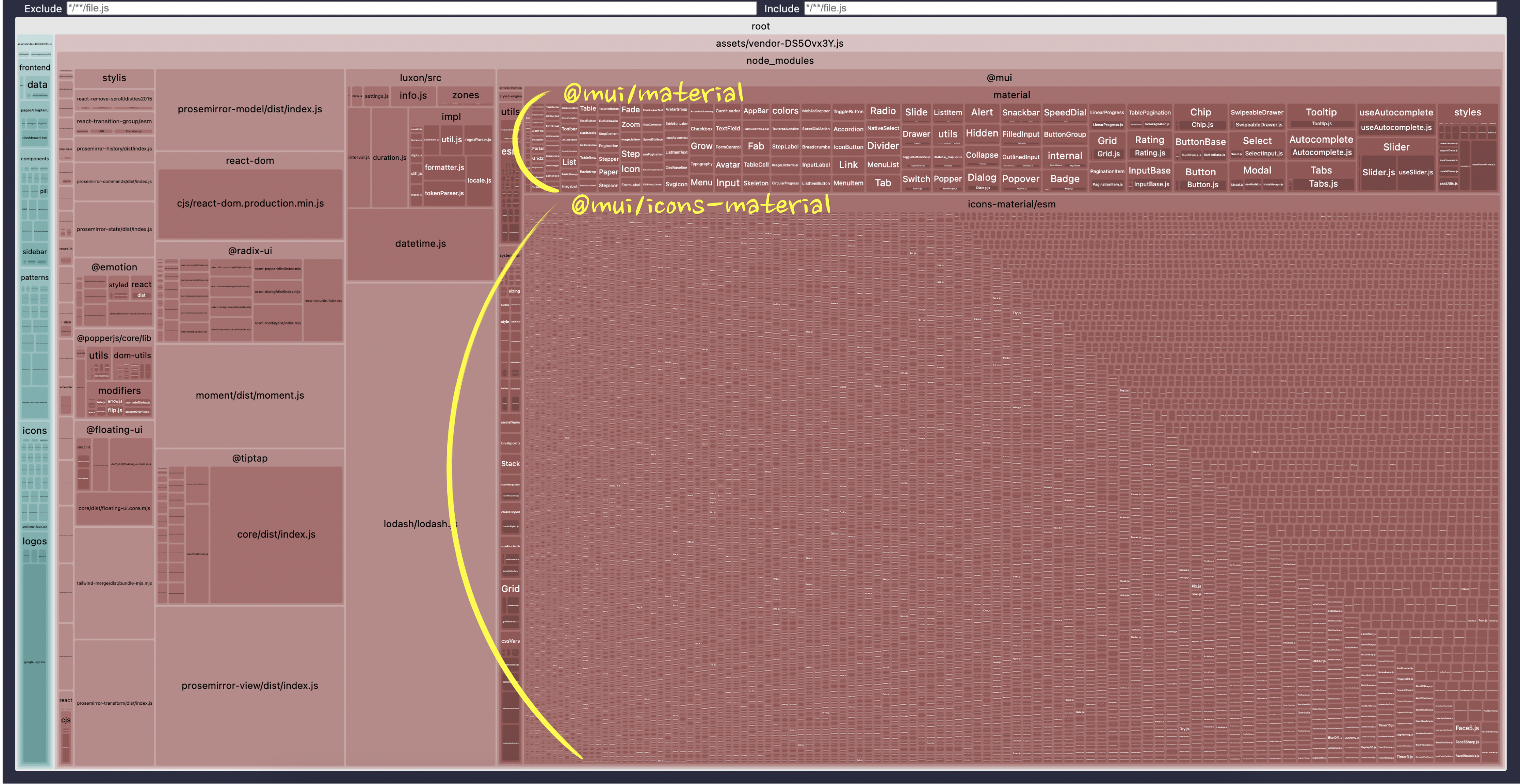
Everything inside is the content of those packages.
Step 2: Understand the Package
Quick googling tells us what those packages are: the material package is Google's Material UI components library, and icons-material is a set of icons for this library that is installed separately.
If we zoom in on the "material" package, we'll see that it includes all of the possible components. I can see Snap, Alert, Tooltip, etc - hundreds of them. The same story if I zoom in on the "icons-material" block - looks like the entire set of 2000 icons is included in the bundle.
No wonder the bundle is 5 MB!
Step 3: Understand the Usage of the Package
For this step, we need to read a lot of code - we need to understand where exactly those packages are coming from. The very first thing we can confirm is whether we're using those packages directly in our code or if something else is using them indirectly. Luckily, for those two, it's easy: we just need to do a text search across the code inside the frontend and src folders for @mui - those are the only places where we have our frontend code.
The search will give us two files: frontend/icons/index.tsx has an import from "@mui/icons-material", and frontend/utils/ui-wrappers.tsx imports from "@mui/material".
The code that uses the icons looks like this:
import * as Material from "@mui/icons-material";export const Icons = {...Material,BellIcon,... // other icons};
Clearly, someone was trying to unify the usage of all the icons in the project. The intent here likely was that all the icons would be grouped under the same Icons namespace, with the assumption that it would help reduce the chance of having icons with the same name in the project and make it easier in the future to move icons to a new library if there is a need. With a pattern like this, in the code you wouldn't import icons directly from "@mui/icons-material", but rather import them all from this file and use them like this: <Icons.BellIcon />.
If you do the search through the project for Icons. (the dot at the end allows us to narrow it down), you'll see that this is exactly what is happening in three files: two dialogs and a message-list component. Or you can search for "usages" if your IDE supports that, of course.
In theory, it's quite a noble idea, and indeed would've made future refactoring much easier - you'd need to refactor just one file if you want to replace the icons, and the rest of the code wouldn't even know that something changed. Plus, it makes it super easy to see which icons are available in the project via autocomplete (if your IDE supports it).
In practice, we ended up with two thousand icons in our bundle 😬.
And exactly the same story with the "material" library usage:
import * as Material from '@mui/material';export const StudyUi = {Library: Material,Button: Button,};
Someone wanted to expose all the available components through a unified interface, probably for exactly the same reason as the icons. That's one of the reasons why we're investigating them together here 🙃 Search for StudyUi.Library to confirm that this is indeed what is used somewhere in the code.
Step 4: Confirm That This is the Problem
Before attempting any refactorings, which in real life could be very costly, we first need to confirm that we have identified the problem correctly.
For now, let's just comment out the import part for both of those libraries.
// Just comment out those imports everywhere// import * as Material from "@mui/material";// import * as Material from "@mui/icons-material";
And then rebuild the project. It won't start since we haven't fixed the usage of those libraries yet. But it will be enough to see whether the bundle size has reduced or not, and confirm whether those imports were the problem.
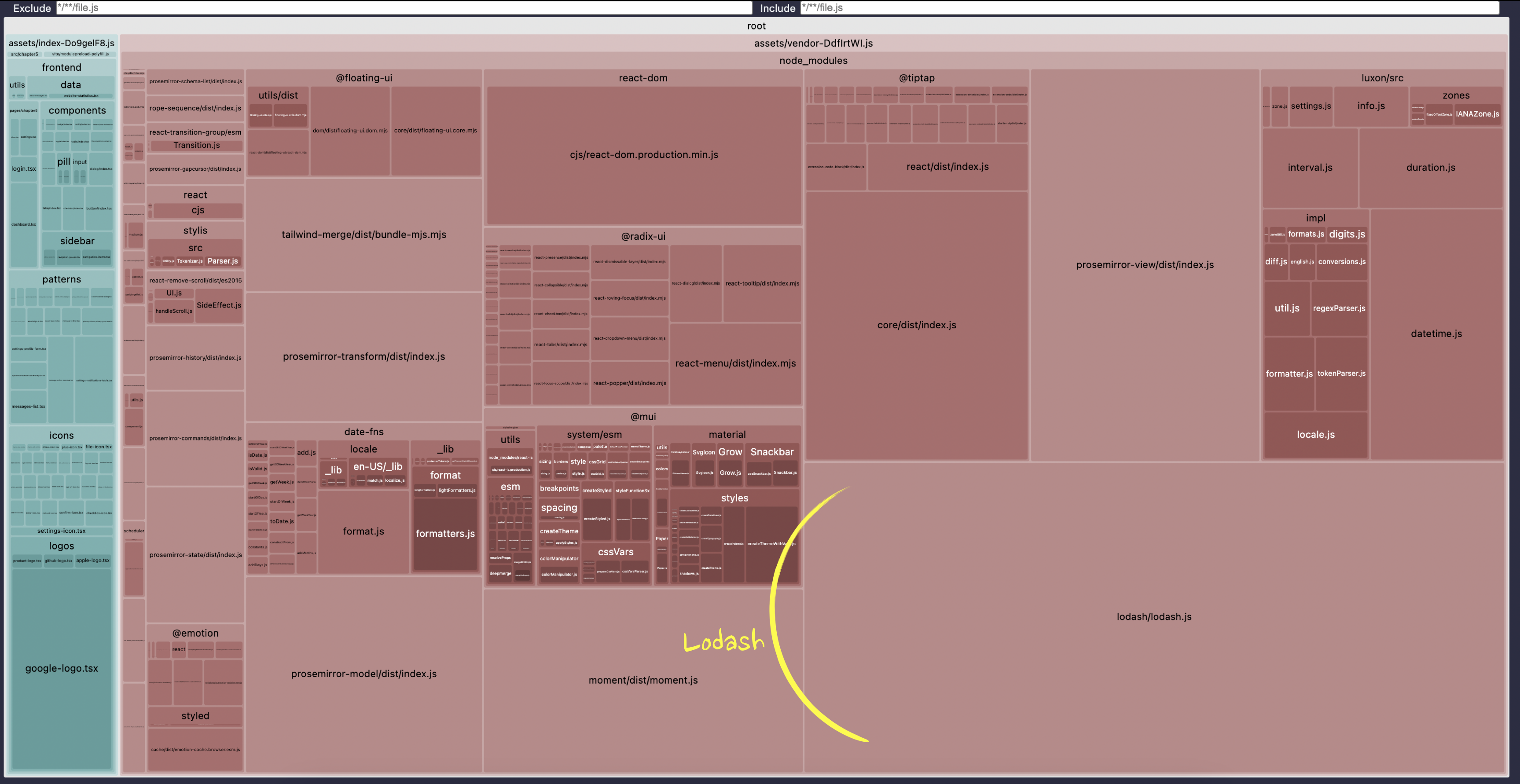
And indeed it works! The "vendor" file shrunk from 5 MB to 811 KB, and the visualization now looks like this:
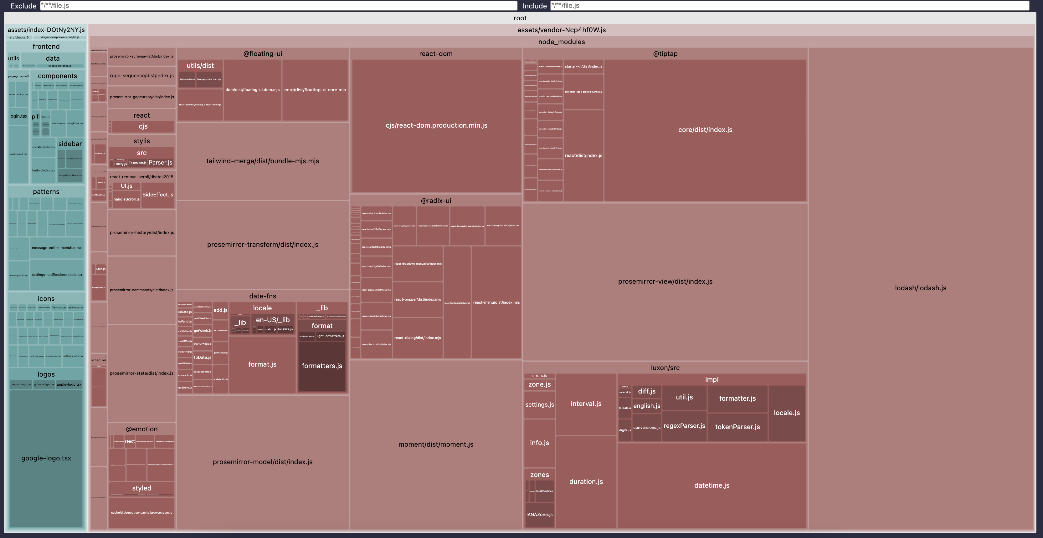
The teal "index" chunk is much more visible since we shrunk the vendor so much. There are no more @mui packages, and other libraries like prosemirror-view and lodash have become much more visible.
Now, all we need to do as a final step is to fix the problem properly. But first, we need to identify what the actual problem here is. Surely not everyone who uses MUI components and icons ends up with 5 MB bundles because of them? No one would use them in this case. So, something is wrong in our code.
To understand this, we need to know a concept known as "tree-shaking".
Tree Shaking and Dead Code Elimination
Modern bundlers not only merge JavaScript modules together. They also try to identify and remove "dead code", i.e., the code that is not used anywhere. And they are pretty good at it.
Try, for example, adding this code somewhere:
export const MyButton = () => <button>Click me</button>;
Let's say in frontend/components/button/index.tsx, where we keep all our buttons.
And then rebuild the project.
You should notice that the index chunk stays with exactly the same name and exactly the same size with or without this code. That's because we're not using this button anywhere, it just sits there.
Now, try to add a new MyDialog component somewhere in frontend/components/dialog/index.tsx that uses this button:
import { MyButton } from '@fe/components/button';export const MyDialog = () => {return (<><MyButton /><div>My dialog</div></>);};
Then rebuild the project. The result should be exactly the same! Same name for the chunk, same size. We still haven't used this code - the MyDialog component still sits there and does nothing. The bundler was able to detect that and got rid of both MyDialog and MyButton in the production files. Crazy smart, right?
Only when the component is used in the code that forms the app for real will it be included. Try to render the MyDialog somewhere inside App.tsx, for example:
import { MyDialog } from '@fe/components/dialog';export default function App() {// keep the rest of the code as isif (path.startsWith('/settings')) {return (<><SettingsPage /><MyDialog /></>);}// keep the rest of the code as is}
And rebuild the project. The index chunk name changes, the size slightly increases. You can even open the index chunk and search for the "Click me" string to verify that the new button is included.
This process of eliminating unused code is known as "tree-shaking".
It's called this way because the bundler creates an abstract "tree" from all the files and exports/imports within the files, tracks down "alive" and "dead" branches of that tree, and then removes the "dead" ones. Before we included the MyDialog in App.tsx, the "tree" would look something like this (simplified):
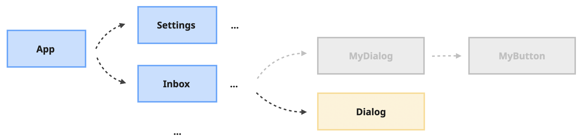
The index.tsx file inside the frontend/components/dialog folder exports multiple components, including a generic Dialog that is used in a few places. Our MyDialog, which is not used anywhere, is marked in gray (i.e., a "dead branch"). The gray branches will be excluded from the final bundle.
When we explicitly included MyDialog in the App.tsx, the tree changed into this:
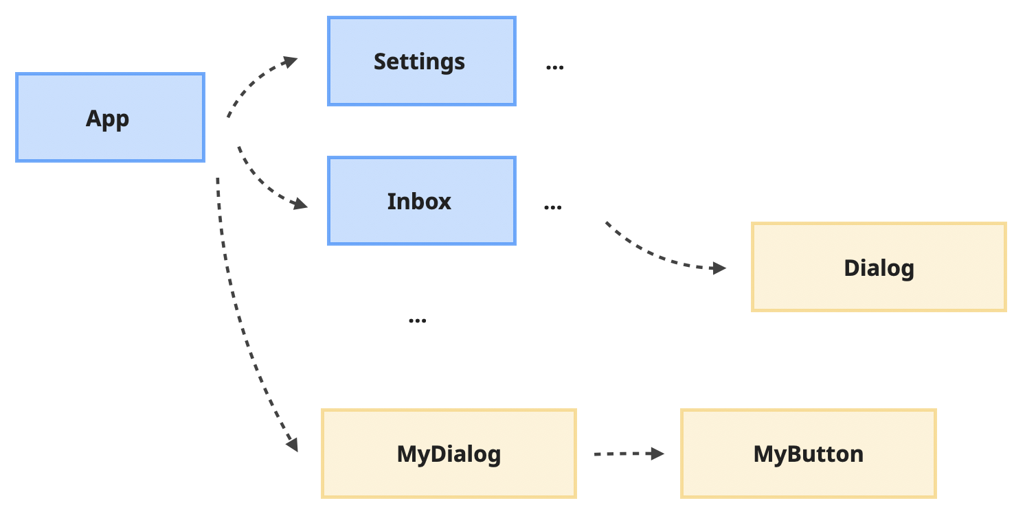
The MyDialog branch is not dead anymore, and as a result, it's included in the bundle.
Modern bundlers are getting smarter and smarter, and it becomes harder and harder to fool them when it comes to tree-shaking. It's still possible, however, for a determined person 😅
One of the things they can't deal with yet is the * import in combination with renaming. * import is this:
import * as Buttons from '@fe/components/button';
It's basically a command to import everything from the module and alias it as Buttons. Then, we can use the buttons we need via dot notation:
<Buttons.SmallButton />
This pattern is quite popular, especially when there are many exports from one module, when you want to avoid importing them one by one:
import { Button, SmallButton, LargeButton } from '@fe/components/button';
And by itself, this * import is actually not enough to confuse the bundler - told ya they are smart! However, when it's used as a variable, not just the means to extract what's inside… The bundlers can't handle it yet.
This scenario is a classic example:
import * as Buttons from "@fe/components/button";import * as Dialogs from "@fe/components/dialog";// the rest of the componentsexport const Ui = {Buttons,Dialogs,...};
Try to add this code to the App.tsx file instead of the previous example and render a "normal" button using the dot pattern:
import * as Buttons from '@fe/components/button';import * as Dialogs from '@fe/components/dialog';export const Ui = {Buttons,Dialogs,};export default function App() {// keep the rest of the code as isif (path.startsWith('/settings')) {return (<><SettingsPage /><Ui.Buttons.SmallButton /></>);}// keep the rest of the code as is}
Then, rebuild the project, open the index chunk inside the assets folder, and search for the "Click me" string - the string we used in our MyButton button. Although we didn't use the MyButton explicitly, its code is now included there.
If you've never seen this pattern before, it might look a bit ridiculous. Why would anyone do that?
One of the reasons namespacing like that gained popularity is because it allows for much simpler imports and much more explicit code. For example, try putting this code in the index.tsx file in frontend/components and add the rest of the components from @fe/components to the imports there.
import * as Buttons from "@fe/components/button";import * as Dialogs from "@fe/components/dialog";// all other frontend componentsexport const Ui = {Buttons,Dialogs,...// all other components};
Now, I can collapse individual imports of components everywhere to just this:
import { Ui } from '@fe/components';
Look at the frontend/patterns/confirm-archive-dialog.tsx file, for example. All of those:
import { NormalToLargeButton } from '@fe/components/button';import { Dialog, DialogBody, DialogClose, DialogDescription, DialogFooter, DialogTitle } from '@fe/components/dialog';// one million other imports
Could've been just import { Ui } from "@fe/components";
And everything else would've been used via a namespace:
<Ui.Dialogs.Dialog />
Many people love the clarity this pattern gives. For every component I use, I see where it originated from immediately within the context of the function. Plus, no name collisions, which is always nice.
But as a result, this pattern confuses the bundler, tree-shaking on this code doesn't work, and our final JavaScript size is larger than it should be.
For our own code, this might not be that big of a deal - after all, everything that we write, we write with the intention of using it. And one or two forgotten functions won't make much of a difference.
When it comes to external libraries, however, it's a completely different story. Because this is exactly the pattern we used for our @mui components:
import * as Material from '@mui/material';export const StudyUi = {Library: Material,};
And icons:
import * as Material from "@mui/icons-material";export const Icons = {...Material,BellIcon,... // other icons};
The quick fix here, if we want to preserve the pattern and namespaces and avoid global refactoring, is to get rid of the * import and import only the components and icons we use. Get rid of all the changes that we made in the frontend part of the project, and instead do this:
// frontend/utils/ui-wrappers.tsx fileimport { Button } from '@fe/components/button';import { Snackbar } from '@mui/material';export const StudyUi = {Library: {// this is the only component we use from the Material librarySnackbar: Snackbar,},Button: Button,};
/// frontend/icons/index.tsx fileimport { Star } from "@mui/icons-material";// keep the rest of the importsexport const Icons = {Star: Star, // this is the only icon we use from the Material set... // the rest of the icons};
Rebuild the project again. The bundle is now 878 KB instead of 5 MB - we clearly got rid of unnecessary icons and components from @mui. Open the stats.html file - it now looks like this:
We still have the @mui block here since we do use it. But now it's much smaller and overshadowed by other larger blocks. So let's consider our "mui" problem solved for now and look at the other problems.
But before that, we need to make sure that the fix didn't break the app. Start the project and navigate to the "Inbox" page: you should see the gold star at the beginning of each message - that's the star icon we used from MUI. Click on the "delete" button that appears when you hover over any message, and click the "Yep, do it!" button - a notification should appear at the bottom left corner of the page. That's our Snackbar component from MUI. Everything works as expected!
ES Modules and Non-tree-shakable Libraries
Now that we fixed the @mui dependencies and their block doesn't take the entire screen, we can see other problematic inclusions into the bundle more clearly. For example, there is this big lump of "lodash" on the bottom right. What's going on there? Why is it so big?
We'll apply exactly the same process for the investigation. First, quick research into the Lodash library - it's a JavaScript library that implements quite a number of utilities for arrays, objects, lists, and so on, that are mostly not available as native JavaScript functions.
Search for its usage throughout the project files gives us a single place - in the frontend/pages/inbox.tsx file. This is the code, a bit simplified:
// FILE: frontend/pages/inbox.tsximport _ from "lodash";export const InboxPage = () => {const onChange = (val: string) => {// This is the only place where we use the libraryconst cleanValue = _.trim(_.lowerCase(val));// Send cleanValue to the serverconsole.info(cleanValue);};return ...};
We import the entire library via import _ and then use trim and lowerCase utils on a text string before sending it to the backend. Since it's a search field, it's safe to assume it's going to be used for async autocomplete, so the usage seems legit. Let's ignore for a second that we probably didn't need the library at all here, since all modern browsers support trim and toLowerCase already. The point of this exercise is to focus on bundle investigation and what kind of gotchas we can expect.
Let's focus on the fact that we use just two simple utils from a huge library here. There is no way those two simple functions need so much JavaScript. It's a clear indication that the tree-shaking has failed, and we imported the entire library and all of its content.
To validate this assumption (as we should do with absolutely any assumption when it comes to performance investigations), we can simply remove one of the utils:
// remove the lowerCase util, keep only trimconst cleanValue = _.trim(val);
If tree-shaking works correctly, the size of the vendor chunk should decrease a little and the name of the chunk should change since the unused lowerCase util will be "shaken out".
Notice the name and size of the vendor chunk, make the change from above, and rebuild the project.
Nothing changes. The tree-shaking doesn't work. Maybe it's because we're importing the entire library with import _ from and it confuses the bundler somehow? Change it to be an explicit import and try again:
import { trim } from 'lodash';// inside onChange callbackconst cleanValue = trim(val);
The bundle name changes, and the size changes by two bytes, which is clearly not enough to eliminate an unused util. It's probably just because we changed the name in the import. If you compare the resulting vendor chunks "before" and "after" this change in your IDE (if it supports this type of comparison), you'll see that this is indeed the case - just a few minified variables were renamed, the rest is still the same.
Tree-shaking doesn't work at all, as we have just proven.
The problem here is that we have different module formats in JavaScript: ESM, CJS, AMD, UMD. "Module" is a single reusable piece of code that can be loaded into another piece of code. These formats define how this reuse happens.
The full history of those modules, the comprehensive differences, and how they are used and distributed in modern tools would need a book. Fortunately, we only need to know one thing for the bundle size investigations.
When you see import { bla } from "bla-bla" or export const bla or export { bla } - it's ESM format. Our entire project is ESM, and it's pretty much the standard these days, at least when it comes to writing frontend code. Modern bundles can easily tree-shake ESM format, as we've seen already while experimenting with tree-shaking in our own code. Everything else that is not ESM is very hard to tree-shake.
ESM is a relatively new format, and not all libraries have caught up with it yet. You can check whether a library is ESM or not with a tiny is-esm npm package. It's a CLI tool that gives you a Yes/No answer. If Yes, it's ESM and it will be tree-shaken.
npx is-esm lodash
The answer here is No.
For comparison, run it on @mui/icons-material and @mui/material - the result will be Yes.
This answers the question of why the material packages were tree-shaken, but lodash was not.
Now, what to do about it? Unfortunately, the answer for some libraries, especially really old ones, will be "nothing." We either need to accept the consequences of the bundle size or get rid of the library altogether.
Some libraries, however, especially if they are actively maintained, will provide a workaround. While the "main" entry file is not ESM, they might provide additional entries for smaller pieces of the library that allow importing only what you need.
@mui/icons-material actually does that in addition to ESM format. You can import the icon that you need directly from the package and rely on tree-shaking to work:
import { Star } from '@mui/icons-material';
Or you can import the icon directly from its own entry point and not live in fear of tree-shaking failing for some obscure reason:
import Star from '@mui/icons-material/Star';
Whether a library provides this additional way to import is usually documented in some way or form. Material icons, for example, suggest the precise import as a default way to use the icons.
If we look at Lodash documentation, they also mention those types of imports:
// Cherry-pick methods for smaller browserify/rollup/webpack bundles.var at = require('lodash/at');
Let's try to use this in our project and see what it does to the bundle size.
The code we started with is this:
import _ from "lodash";export const InboxPage = () => {const onChange = (val: string) => {// this is the only place were we use the libraryconst cleanValue = _.trim(_.lowerCase(val));// Send cleanValue to the serverconsole.info(cleanValue);};return ...};
With the bundle size for the vendor chunk being around 878 KB.
We need trim and lowerCase utils. If we use the precise imports, it will transform into this:
// change the imports to be preciseimport trim from "lodash/trim";import lowerCase from "lodash/lowerCase";export const InboxPage = () => {const onChange = (val: string) => {// Get rid of the _ and use the utils namesconst cleanValue = trim(lowerCase(val));// Send cleanValue to the serverconsole.info(cleanValue);};return ...};
Rebuild the project, and the bundle size goes down to 812.95 KB! Looks like it worked. Open the stats.html file to see that the previously huge Lodash block is barely visible now.
Although, if we're being serious, in an actual non-study project, I'd just remove those two: if I don't need IE9 support, trim can be replaced with native JavaScript trim, and lowerCase can be replaced with native toLowerCase. The code will then turn into this:
export const InboxPage = () => {const onChange = (val: string) => {// Get rid of lodash completelyconst cleanValue = val.toLowerCase().trim();// Send cleanValue to the serverconsole.info(cleanValue);};return ...};
And after rebuilding, the bundle size goes down by another ~10 KB.
Common Sense and Repeating Libraries
I'm getting more and more excited as our bundles shrink! There is something satisfying in removing code. Let's do more of this!
The next important thing to look at when investigating bundle sizes is common sense. I know, it sounds ridiculous, but you'll see what I mean in a second 😅.
The big advantage of using the modern open source ecosystem is that you can find a few libraries for pretty much any use case. The big disadvantage is exactly the same - for pretty much any use case, there will be a few libraries. And in big projects, especially when there are multiple teams involved, there is a pretty high chance that someday a few libraries that solve exactly the same use case will show up in the bundle.
This especially often happens with stuff like dates, animations, resizing, infinite scrolling, forms, charts, and so on - pretty much everything that is too painful or too complicated to implement from scratch and generic enough to be extracted into a library.
Let's look at our already slightly cleaned-up bundle chart and squint really hard at the highlighted areas.
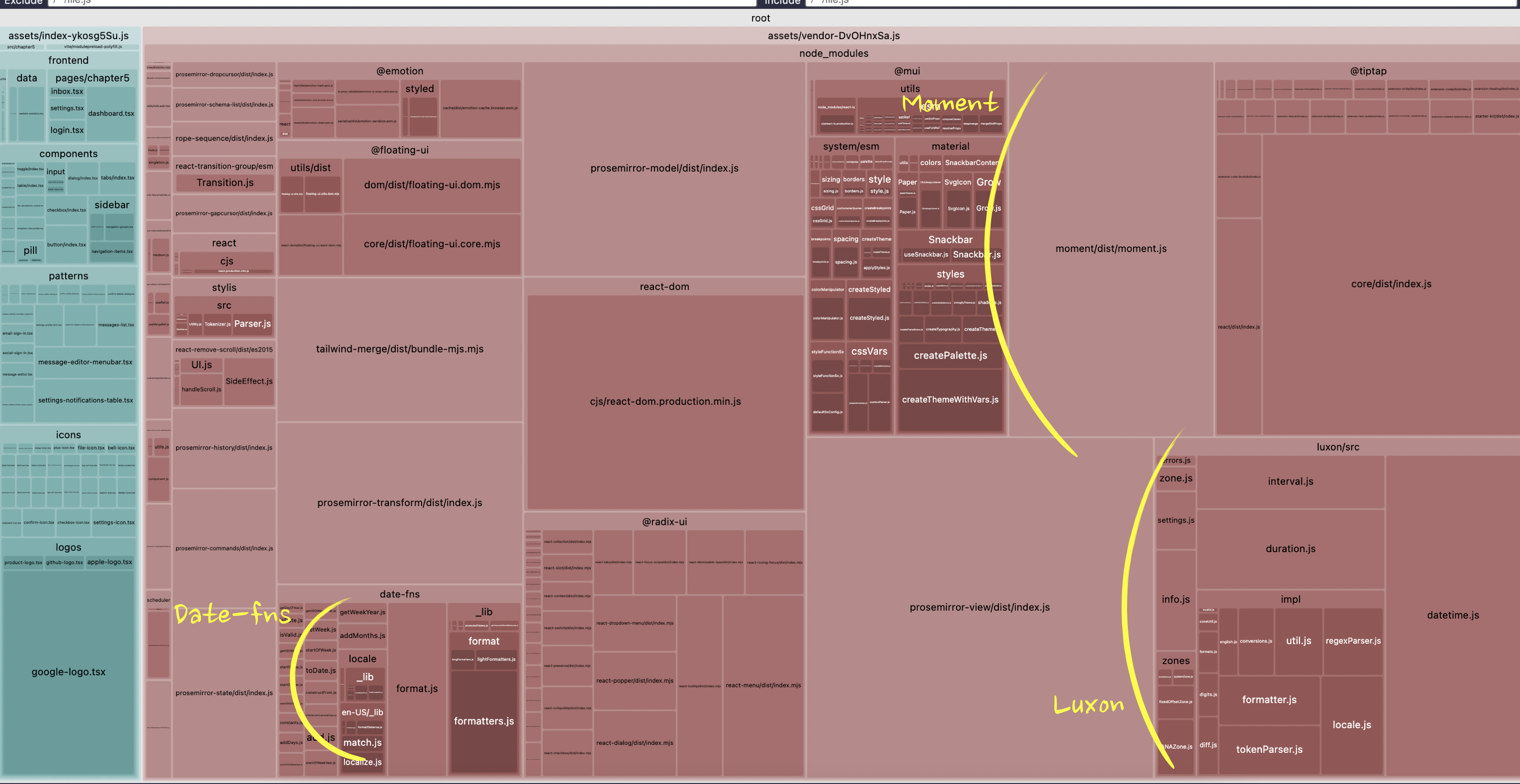
We have three quite significant in size libraries: date-fns, moment, and luxon. Quick googling reveals that:
- date-fns is a library for manipulating Dates in JavaScript.
- moment is also a library for manipulating Dates.
- And luxon, you guessed it, also a library for manipulating Dates.
🤦🏼♀️ Someone really didn't do any due diligence before introducing yet another Dates library.
What to do in this situation really depends on how much code would need to be refactored to get rid of some of them, how much effort it will take, and how many KB of bundle size we're ready to tolerate for the functionality a library gives us.
It might happen, especially in old projects, that the Moment library is used pretty much everywhere, and the newer Luxon and Date-fns are just in a few places. So, in this case, it could make more sense to get rid of the newer ones as a quick win if the time dedicated to the bundle size initiative is restricted, and focus on other areas. Or it could be the opposite, and Moment could be a leftover of a large refactoring that someone forgot to remove in a few places.
In our case, the project is very new, and each of the libraries is used only once. So the refactoring to unify usage will be easy.
In this case, it all comes down to which library allows tree-shaking or specific imports, which API I like the most, which one is maintained, and all the other things you usually consider when choosing a library.
Running the tree-shaking check reveals that moment is not tree-shakable, and a quick scroll through its documentation doesn't show anything that allows targeted imports like lodash does. So this one is out.
Luxon seems to be tree-shakable, but looking at our bundle chart, it's still much bigger than date-fns. So either tree-shaking is flawed there, or it's just naturally large. Doesn't really matter here, since date-fns is an option, I like its API anyway, and it's much smaller.
There is also the option of just removing all three of them - our use cases are pretty simple. But personally, a proper dates library will be the last library I remove from any project. I hate dealing with the native Date API in JavaScript. So I'll just refactor everything to date-fns.
In frontend/patterns/message-editor.tsx file, I have Luxon and this code that uses it:
// FILE: frontend/patterns/message-editor.tsximport { DateTime } from 'luxon';// inside MessageEditor componentconst formattedDate = DateTime.fromMillis(timestampDate).toFormat('MMMM dd, yyyy');
It just converts a milliseconds value to a human-readable format, easy enough. In date-fns the alternative will be this:
import { format } from 'date-fns';// inside MessageEditor componentconst formattedDate = format(new Date(timestampDate), 'MMMM dd, yyyy');
In the frontend/patterns/messages-list.tsx file, I have Moment and this code that uses it:
// FILE: frontend/patterns/messages-list.tsximport moment from 'moment';// inside MessageList componentmoment(message.date).format('MMMM Do, YYYY');
Exactly the same use case as with Luxon - I have a date in milliseconds that I convert to a human-readable format.
Refactoring it into date-fns:
import { format } from 'date-fns';// inside MessageList componentformat(new Date(message.date), 'MMMM do, yyyy');
Rebuilding the project, and boom! Bundle size drops by 20%, from 804.34 KB to 672.52 KB. Check the stats.html to enjoy the lack of huge Moment and Luxon blocks 💃🏻.
Let's remove something else while we're on a roll. The chart now looks like this:
There are lots of packages with prosemirror and tiptap in the name - we'll deal with them later.
There are visible @mui and date-fns blocks, which we have shrunk already.
There is a big chunk of @radix-ui. These are UI primitives that I use to build the "core" components. I'm not going to touch them now, since I'm definitely not migrating away from Radix in the scope of this project.
There is the @floating-ui library - a quick google reveals that this is a library used for positioning dropdowns, tooltips, and other floating elements. Libraries like that are a high risk for duplicates, as happened with Dates. A few more minutes staring at the chart, and I don't see anything visible that could be a library with similar functionality. So this one can stay.
There is also the tailwind-merge library. The Study Project uses Tailwind for styling, and this library is essential when dealing with Tailwind, so this one can also stay.
And finally, there is a block of @emotion.
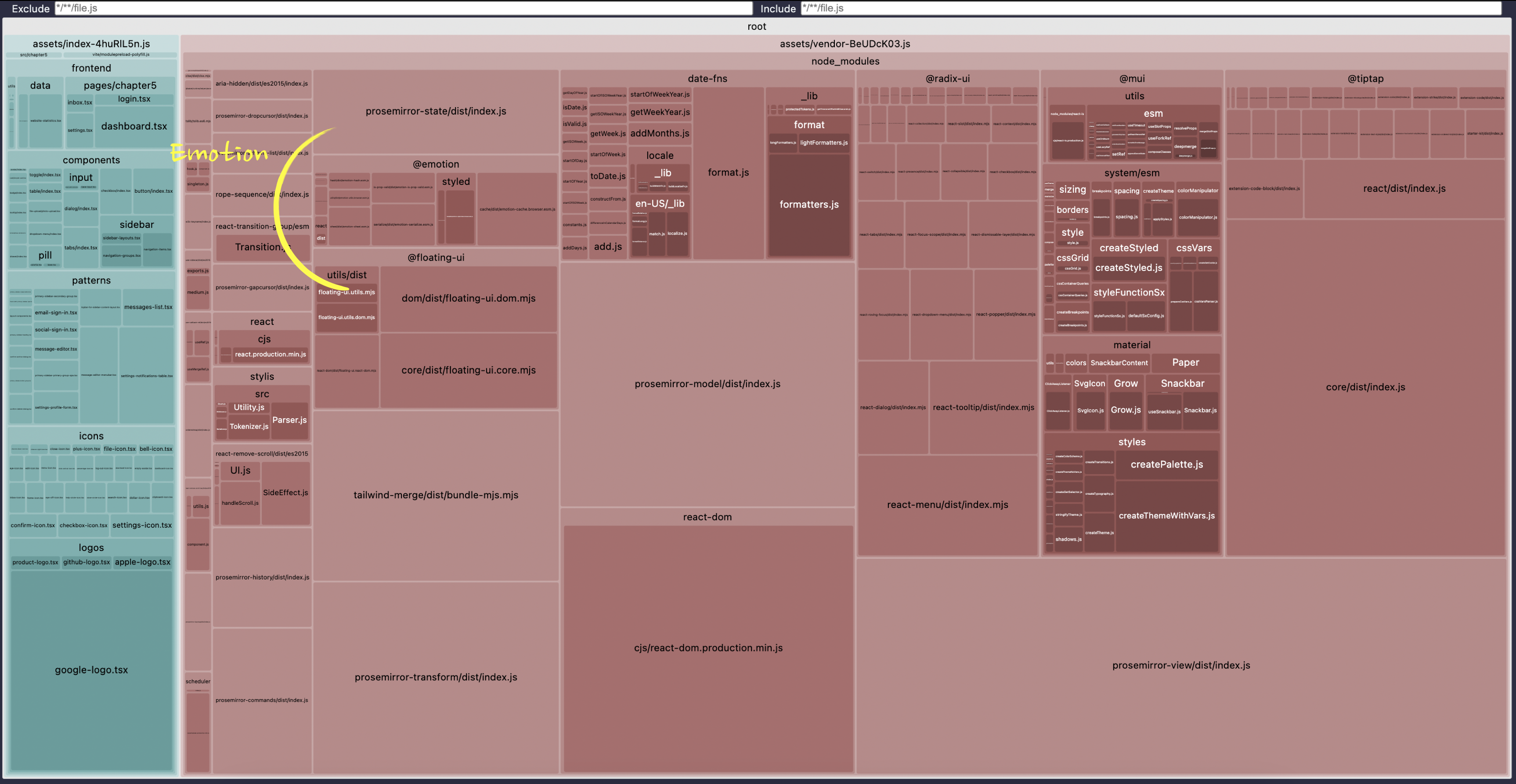
While it's relatively small, especially compared to all the prosemirror-related blocks, its presence here raises an eyebrow. Emotion is a CSS-in-JS library, i.e., it's used to style the website instead of dealing with pure CSS. However, we already have Tailwind for this!
If not for the bundle concern, we should remove it just for the sake of reducing the complexity of the project, if we can.
Searching for usages of @emotion in the project reveals just one place where it's used:
// FILE: frontend/patterns/confirm-delete-dialog.tsx fileimport styled from '@emotion/styled';const Center = styled.div`text-align: center;`;// inside ConfirmDeleteDialog component<DialogDescription className="px-8"><Center>Are you sure you want to delete this message? You won't be able to recover it.</Center></DialogDescription>;
This is a typical case of refactoring going slightly wrong in a large project. Most likely, someone refactored the project to Tailwind in one pull request, and at the same time, someone added this div in another pull request in parallel, and they were merged at the same time. Happens all the time. Now, removing it is our duty. No broken windows should be left broken.
Luckily, it's still easy. We just need to kill the import and the div and add a classname to center the text instead of this component:
// FILE: frontend/patterns/confirm-delete-dialog.tsx file// remove the import and the Center component// inside ConfirmDeleteDialog component// remove the Center element and add the new className<DialogDescription className="px-8 text-center">Are you sure you want to delete this message? You won't be able to recover it.</DialogDescription>
Rebuild the project, and…
The vendor chunk stays exactly the same size 🤔 What?.. The Emotion package is still there for some reason. Open the stats.html file to confirm that.
But why?
Transitive Dependencies
A library can't end up in the bundle by accident. If it's there, it was used somewhere. If it's not used in our project code directly, that means that it was used by some library, which in turn was used in the code. This happens quite often with "foundation" level libraries, i.e., libraries people use to build something on top of them, like positioning libraries and various utils libraries like lodash.
Dependencies like this are called "transitive" dependencies. To identify where a library comes from, we can use npm-why util:
npx npm-why @emotion/styled
It will give us the list of all the places where the package @emotion/styled is used, either directly or indirectly:
Who required @emotion/styled:study-project > @emotion/styled@11.14.0study-project > @mui/icons-material > @mui/material > @emotion/styled@11.14.0study-project > @mui/icons-material > @mui/material > @mui/system > @emotion/styled@11.14.0study-project > @mui/icons-material > @mui/material > @mui/system > @mui/styled-engine > @emotion/styled@11.14.0study-project > @mui/material > @emotion/styled@11.14.0study-project > @mui/material > @mui/system > @emotion/styled@11.14.0study-project > @mui/material > @mui/system > @mui/styled-engine > @emotion/styled@11.14.0
The result, hopefully, is self-explanatory. We use @emotion/styled directly in the Study Project, which checks out - we indeed do have it in our package.json. And then both @mui/icons-material and @mui/material use it through a chain of other libraries.
That's a bummer - I thought we could forget about @mui when we fixed its import. But it looks like we need to make a hard decision.
Because the only solution here now, if we want to remove the @emotion libraries from the bundle, is to remove everything that uses them - our direct usage of @emotion and usages of both @mui libraries.
This instantly escalated the solution from a "quick fix" to a potentially very time-consuming refactoring, especially in real code.
In the Study Project, we can still do it, just to see how far we can push the bundle size reduction. In the real code, it will always be a trade-off between the time spent on refactoring and the potential benefits.
Removing @mui/material
First, find where it's used:
// FILE: frontend/utils/ui-wrappers.tsx fileimport { Snackbar } from '@mui/material';export const StudyUi = {Library: {Snackbar: Snackbar,},Button: Button,};
And delete the import and the usage:
import { Button } from '@fe/components/button';export const StudyUi = {Button: Button,};
Then find where the Snackbar component is used:
// FILE: frontend/patterns/messages-list.tsx fileimport { StudyUi } from '@fe/utils/ui-wrappers';// Inside MessageList component<StudyUi.Library.Snackbar open={openSnackbar} onClose={() => setOpenSnackbar(false)} message="Message deleted!" />;
This is a notification component shown when a message is deleted. Since we use Radix for everything else, we can replace this component with Radix's Toast component, which does exactly the same thing. We haven't used this component before, so it might increase our bundle size. However, I hope that the removal of @mui and @emotion will compensate for this increase. We'll measure the result when we're done with refactoring.
For now, just replace the usage with this:
// FILE: frontend/patterns/messages-list.tsx fileimport * as Toast from '@radix-ui/react-toast';// Inside MessageList component<Toast.Provider swipeDirection="left" duration={3000}><Toast.RootclassName="grid grid-cols-[auto_max-content] bg-blinkNeutral50 items-center gap-x-4 rounded-md bg-white p-4 shadow-[hsl(206_22%_7%_/_35%)_0px_10px_38px_-10px,_hsl(206_22%_7%_/_20%)_0px_10px_20px_-15px] [grid-template-areas:_'title_action'_'description_action'] data-[state=open]:animate-slide-in-left"open={openSnackbar}onOpenChange={() => {setOpenSnackbar(false);}}><Toast.Title className="text-base font-medium p-2 [grid-area:_title]">Message deleted!</Toast.Title></Toast.Root><Toast.Viewport className="fixed bottom-4 right-4 z-50 m-0 flex w-[390px] max-w-[100vw] list-none flex-col gap-2.5 outline-none" /></Toast.Provider>;
Removing @mui/icons-material
Find where it's used:
// FILE: frontend/icons/index.tsximport { Star } from "@mui/icons-material";export const Icons = {Star: Star,... // other icons};
It's a generic "Star" icon that we use to highlight whether a message is in favorites or not. We actually already have a "Star" icon in our collection of local icons, so we can just reuse it instead:
// frontend/icons/index.tsx fileimport { StarIcon } from "@fe/icons/star-icon";export const Icons = {Star: StarIcon,... // other icons};
You don't even need to find its usage anywhere. That's the beauty of this namespacing pattern in this case - it should just work.
Rebuild the project, start it, and navigate to "Inbox". All messages should now have an "empty" Star icon, that's the new non-MUI one. In a real project, you'd want to replace the old icon with exactly the same one as before, but in our case, it's useful that they are different - at least we see that the changes work.
Hover over any message, click "delete," and click the "confirm" button. The toast component should now appear at the bottom right and be white.
The size of the vendor chunk is now 600.98 KB - it went down by ~70 KB! Looks like our refactoring helped.
Finally, open the stats.html file - everything related to @mui and @emotion should disappear, and a new react-toast block inside @radix should appear.
The Result
I hope this was a fun investigation, and you'll now be able to go through your own projects, identify, and quickly fix all the bundle size issues you have. In the case of this project, I managed to reduce the bundle size from 5MB to 600.98 KB. Or from 878 KB to 600.98 KB if you consider the very first step cheating 😅 Even in this case, it's more than 30% reduction.
And even this is not the limit - there is still a big question of what to do with all the @tiptap and @prosemirror- related libraries in the bundle. Hint: lazy loading, if you really want to know the answer 😉 But about this one, some other time.
By the way, this article is extracted from my latest book, "Web Performance Fundamentals". So if you enjoy the article, you might want to check out the full book too. 😉
Table of Contents
Want to learn even more?

Web Performance Fundamentals
A Frontend Developer’s Guide to Profile and Optimize React Web Apps

Advanced React
Deep dives, investigations, performance patterns and techniques.
Advanced React Mini-Course
Free YouTube mini-course following first seven chapters of the Advanced React book